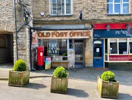
Sign of the times?
According to a new marketing report, badly written chalkboards in pubs can be enough to make sure customers do not visit again.
Marketing company Gecko has just released the results of its first Brandwriting Index, a survey on marketing materials in the drinks industry.
The results revealed customers find handwritten signs a real turn-off, with more than 80 per cent saying they reflect poor customer service and more than half considering taking their custom elsewhere due to spelling or grammar mistakes.
Pubs were voted second worst in the high street for using handwritten marketing materials, finishing above banks and shops.
Gecko marketing director Andy Milner says the results show the extent to which big brands underestimate the impact of local marketing materials.
He says: "Many pubs or bars are essentially leaving important customer communications to staff, perhaps even part-timers or temps, who most probably are untrained in sign-writing and lack full understanding of the company's brand values.
"There's this sense that any form of marketing is better than none, but actually this survey shows that that isn't the case. If a sign is written correctly it's going to have a much better impact on customers."
Neil Saunders, owner of Pub Marketing Expert, agrees. "Signage is like the uniform of a pub," he says. "Chalkboards give someone a first impression of that venue. If they're unprofessional, the consumer feels the pub offering is going to be the same."
If the report makes uncomfortable reading for pubcos and breweries, as Gecko claims, the recent attack on pub fronts from MP Richard Younger-Ross will fail to cheer them up.
The Lib Dem, who used to be an architect and designed two JD Wetherspoon pubs in his time, says homogenised high-street signs are driving character out of towns.
Needs of the building
"In the high street in particular there's a tendency to use exactly the same fronts and signage, whatever the needs of the building it's attached to. Its a one-size-fits-all policy - if it doesn't fit, make it," he says.
"Some pub chains follow this route and I'd just like to say to them you don't need to. From my experience, you can put in corporate identity without it being in-your-face."
But some pubcos have denied they are contributing to the "slow death of the English high street", as Younger-Ross puts it. A spokesman for Punch Taverns says: "Punch always tries to fit in with the fabric and style of the premises and its surroundings. Many of our pubs have much historical background, with character we try to retain as a priority."
One licensee who knows all about character is Alvin Michaels of the Bricklayers Arms in Flaunden, Hertfordshire. When the previous owner got into a spat with locals, he put up a new sign to "get their backs up" - a brickie building a wall with part of his backside exposed.
Michaels says the sign has provided a talking point and is part of the history of the local community, but he has opted for something more generic for his next pub.
"I agree that it's nice to see individuality," he says. "But there's got to be some middle way, because some names and signs are not attractive to people. You've got to retain individual character, but you've also got to keep up with the times."


